
Africa is much larger than it appears on many familiar world maps. The United States voted against it, while Estonia, Georgia, Lithuania, Moldova, Serbia, and Ukraine abstained. Because the maps we have grown up seeing often distort the relative size of continents, making regions closer to the poles appear disproportionately large while shrinking parts of the world closer to the Equator, that is.
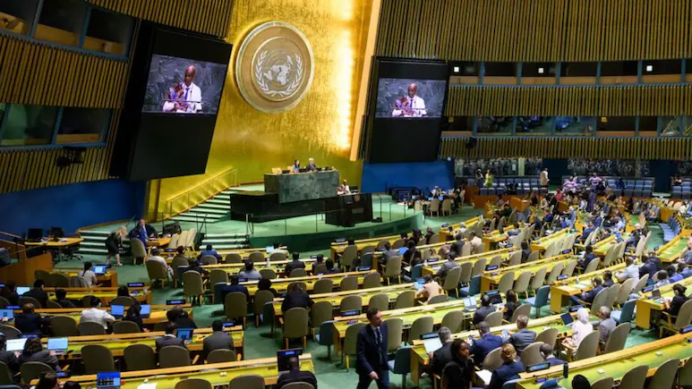
The debate over how the world should be represented on maps has gained fresh momentum after the United Nations General Assembly on September 4, 2026, adopted a resolution promoting more accurate representations of the relative size of continents and other landmasses.
Titled “Correct the Map”, the resolution was passed with 164 countries voting in favour.
France also announced a change in its approach to world maps around the time of the UN vote. Led by Togo on behalf of the African Group and supported by the African Union, the initiative takes aim at the widespread use of the Mercator projection, a 16th-century map designed primarily for navigation. The projection preserves directions and angles well, but significantly exaggerates the size of landmasses as they get farther from the Equator. The resolution encourages the use of equal-area projections, including the Equal Earth projection, when showing the relative size of geographical regions is important. It does not ban the Mercator projection or require governments and organisations to adopt any one map, and it is not legally binding. Instead, it seeks to change how the world is represented in classrooms, international organisations, and other settings where understanding the true relative size of continents matters, putting Africa’s actual scale back into the picture. Why Does The Mercator Map Make Africa Look Smaller? Its major strength was navigation. It preserves angles and allows lines representing constant compass bearings to appear as straight lines, making the projection particularly useful for sailors. But that advantage comes with a significant trade-off. On a Mercator map, landmasses appear increasingly larger the farther they are from the Equator. The United Nations has also noted that some degree of distortion is unavoidable when the Earth’s curved surface is represented on a flat map. The difference is particularly striking when Africa and Greenland are compared. It was designed for a particular purpose and remains useful for navigation. The question is whether it is the most appropriate projection when the purpose is to compare the relative size of continents. ‘Maps Shape Our Understanding Of The World’ Togo’s Foreign Minister Robert Dussey, who led the initiative at the United Nations, has argued that maps influence more than people’s understanding of geography. “They guide education, nourish the imagination, and influence collective perceptions. Supporters of the initiative argue that the repeated visual enlargement of Europe, North America, and other regions farther from the Equator, alongside the apparent reduction in the size of Africa and other equatorial regions, can influence perceptions beyond cartography. The language reflects a broader argument that the way the world is visually represented can shape how different regions are perceived across generations. The underlying scientific point, however, is simpler: no flat map can reproduce the Earth’s curved surface without distortion. Different projections make different choices about what to preserve, whether that is area, shape, distance or direction. What Is The Equal Earth Projection? Unlike Mercator, it is designed to preserve the relative areas of continents while keeping their shapes recognisable. This makes it useful for maps where comparing the size of different regions is important. The UN resolution identifies Equal Earth as one option for representing land areas more accurately. It does not declare Equal Earth the only acceptable world map. The choice of a projection depends on what the map is intended to show and which geographical properties matter most. Why Did The US Oppose The Resolution? The move highlights an important point: reducing distortion in the representation of area does not mean every country or institution has to adopt the same projection. Equal Earth, Eckert IV, and other projections make different compromises between area, shape, distance, and other geographical properties. Ukraine Raises A Different Concern Ukraine supported efforts to improve the representation of Africa and other parts of the Global South but raised concerns about how some maps based on alternative projections represent territories affected by Russia’s occupation. The European Union backed the resolution while stressing that the measure dealt with the relative size of landmasses and did not affect sovereignty, territorial status or internationally recognised borders. When The World’s Map Changed In The Past
As a result, regions in the far north and south can look much bigger than they actually are, while areas closer to the Equator appear relatively smaller. Because different map projections serve different purposes, that distinction is important. Because changing the way territory is displayed on a map does not change its legal status, that distinction is important.
This means Greenland, for example, can appear comparable in size to Africa even though Africa is more than 14 times larger. The Mercator projection was developed by Flemish cartographer Gerardus Mercator and published in 1569. Greenland can appear almost comparable in size to Africa on a Mercator map, even though Africa is roughly 14 times larger in reality. The Equal Earth projection was developed in 2018 as an equal-area projection.
That does not make the Mercator projection a “wrong” map. “Maps shape our understanding of the world,” Dussey said before the vote. The resolution refers to correcting such distortions in terms, including “cognitive justice and memorial reparation”. French Foreign Minister Jean-Noël Barrot said France would move away from the Mercator projection in favour of the Eckert IV projection, another equal-area projection that offers a different way of showing the relative size of landmasses.
The latest UN resolution is part of a much longer history of attempts to represent – and understand – the world. Because of wars, the collapse of empires, independence movements, and the creation of new countries, when Political Borders Changed The World Map Maps have also changed dramatically. Around 150 CE: Ptolemy’s Geography Ptolemy introduced a systematic, coordinate-based method for representing the known world. 1507: Waldseemüller Map The Americas were shown as a separate landmass from Asia, while the Pacific was depicted separately. 1569: Mercator Projection Gerardus Mercator’s projection transformed the globe into a rectangular map that preserved angles and directions particularly well. 1855: Gall Projection The projection offered an equal-area approach that represented the relative size of continents more faithfully. 1921: Winkel Tripel The projection sought a compromise between distortions of area, direction, and distance. 1963: Robinson Projection The Robinson projection aimed to create a visually balanced representation of the world rather than perfectly preserving a single geographical property. 2018: Equal Earth Projection The projection was designed to show continents in their correct relative areas while retaining recognisable shapes. 1918-1923: Collapse Of The Ottoman And Austro-Hungarian Empires Large parts of Europe and the Middle East were redrawn, with new states emerging from the collapse of the two empires. 1945-1950s: End Of European Colonial Empires Countries across Asia and Africa gained independence, significantly reshaping the political map. 1947: Partition Of British India India and Pakistan emerged as independent states, while borders across South Asia were dramatically redrawn. 1948: Creation Of Israel The political map of the Middle East changed significantly following the establishment of Israel. 1989: Fall Of The Berlin Wall The fall of the Berlin Wall marked the symbolic end of the division between East and West Germany and eventually paved the way for German reunification. 1991: Break-Up Of The USSR Fifteen independent states emerged following the dissolution of the Soviet Union, marking one of the biggest changes to the political map of the 20th century. 1991-1993: Break-Up Of Yugoslavia Yugoslavia dissolved through a series of independence declarations and wars, resulting in the emergence of several new states. 1993: Czechoslovakia Splits Czechoslovakia peacefully divided into the Czech Republic and Slovakia. 2011: South Sudan Gains Independence South Sudan became independent and joined the United Nations as its newest member state at the time, creating a new country on the African map.
The United States was the only country to vote against the resolution. France Moves Away From Mercator The resolution nevertheless passed by an overwhelming margin, with 164 countries voting in favour and six abstaining.
The US representative criticised the initiative as part of what Washington described as a broader “radical ideological project”. The American objection focused particularly on references in the resolution to “cognitive justice” and reparations.
